A beginner-friendly resume builder concept designed around one core idea: make creating a professional resume feel straightforward, guided, and less intimidating for first-time users.
Role: Designer + front-end developer HTML + CSS + JavaScript + Bootstrap Research + IA + responsive UI
buildmyresume.com
Scroll to explore
01 · CONTEXT Project overview
Turn a stressful task into a clear digital process
BuildMyResume was developed as a website concept for users who need a quick, approachable way to create a professional resume without advanced design or technical knowledge. The project combined UX planning, interface design, information architecture, and front-end development.
The site concept centered on guided steps, clean templates, clear calls to action, and a structure that could help first-time resume builders understand what to do next instead of confronting them with a feature-heavy dashboard.
Project typeResponsive website conceptResume builder + career support
Core goalMake resume creation easierClear steps for beginner users
02 · DIRECTION Problem + solution
Simple enough to begin. Structured enough to finish.
The design challenge was reducing the uncertainty that comes with building a first resume while still giving users enough structure and guidance to create something professional.
The problem
Resume tools can feel too complicated for beginners
Users may be unsure how to format a resume, what information belongs in it, or whether the final result will look professional enough to send to an employer.
The solution
Guide users through a focused, step-by-step experience
The concept uses clear instructions, template guidance, pre-filled examples, and a direct path from learning how the service works to entering information and downloading a resume.
03 · RESEARCH Journey research
Design around the questions beginners already have
The journey map focused on users who want a professional resume quickly but may not know how to organize or design one. Their biggest frustrations were confusing tools, uncertainty about formatting, and concern that the result would not stand out to employers.
Comparable tools such as Canva and Zety were identified during the research, but the opportunity for BuildMyResume was to stay focused on simplicity and ease of use for first-time resume builders rather than becoming feature heavy.
User goalCreate a professional resume quickly
Users want a clean result without needing technical or design knowledge.
Pain pointFormatting feels intimidating
Complex tools and uncertainty about organizing information can make the process feel overwhelming.
Desired gainConfidence in the finished resume
Users want step-by-step guidance, a professional appearance, and confidence before applying for jobs.
Design opportunityPrioritize guidance over feature volume
Pre-filled examples and a straightforward completion path support users who are building a resume for the first time.
Understand serviceSee how it worksEnter detailsDownload resume
04 · STRUCTURE Information architecture
Keep the site map small and the next step obvious
The sitemap organized the concept around a small set of primary areas: Home, Build Resume, Resources, Contact Us, and About Us, with supporting pages such as How-To, Templates, Job Search Info, Contact Form, and FAQ.
Keeping the structure compact reinforced the research goal of avoiding unnecessary complexity while still giving users access to guidance and support.
Early sitemap outlining the main navigation and supporting content areas. Select the image to enlarge.
05 · PROCESS Wireframes
Test layout options before committing to the visual system
Two early wireframes explored different ways to organize the main call to action, instructional steps, templates, testimonials, advertising space, navigation, and footer content.
The sketches helped compare how much space each element needed and where information should sit before color, typography, photography, and detailed styling were added.
Wireframe 01
Three-column homepage concept with instructions, featured templates, and testimonials.
Wireframe 02
Alternate structure that gives the template area more focus and reserves space for supporting advertising.
06 · SYSTEM Visual system
Use a calm system to support a task that already feels stressful
The visual direction uses a dark navy foundation with teal, soft gray, pale mint, white, and black. The combination creates enough contrast for navigation and calls to action while keeping the overall interface professional and approachable.
Merriweather was explored for serif hierarchy and Montserrat for clean supporting type. Repeated buttons, numbered steps, testimonial components, imagery, branding, and social icons helped establish a consistent interface language.
#B4BEC9#159A9C#002333#DDEFE7
Display explorationMerriweather
Supporting typeMontserrat
The early design system documented typography, palette, reusable UI elements, imagery, branding, and icon direction.
07 · INTERFACE High-fidelity layouts
Translate the planning into a complete desktop experience
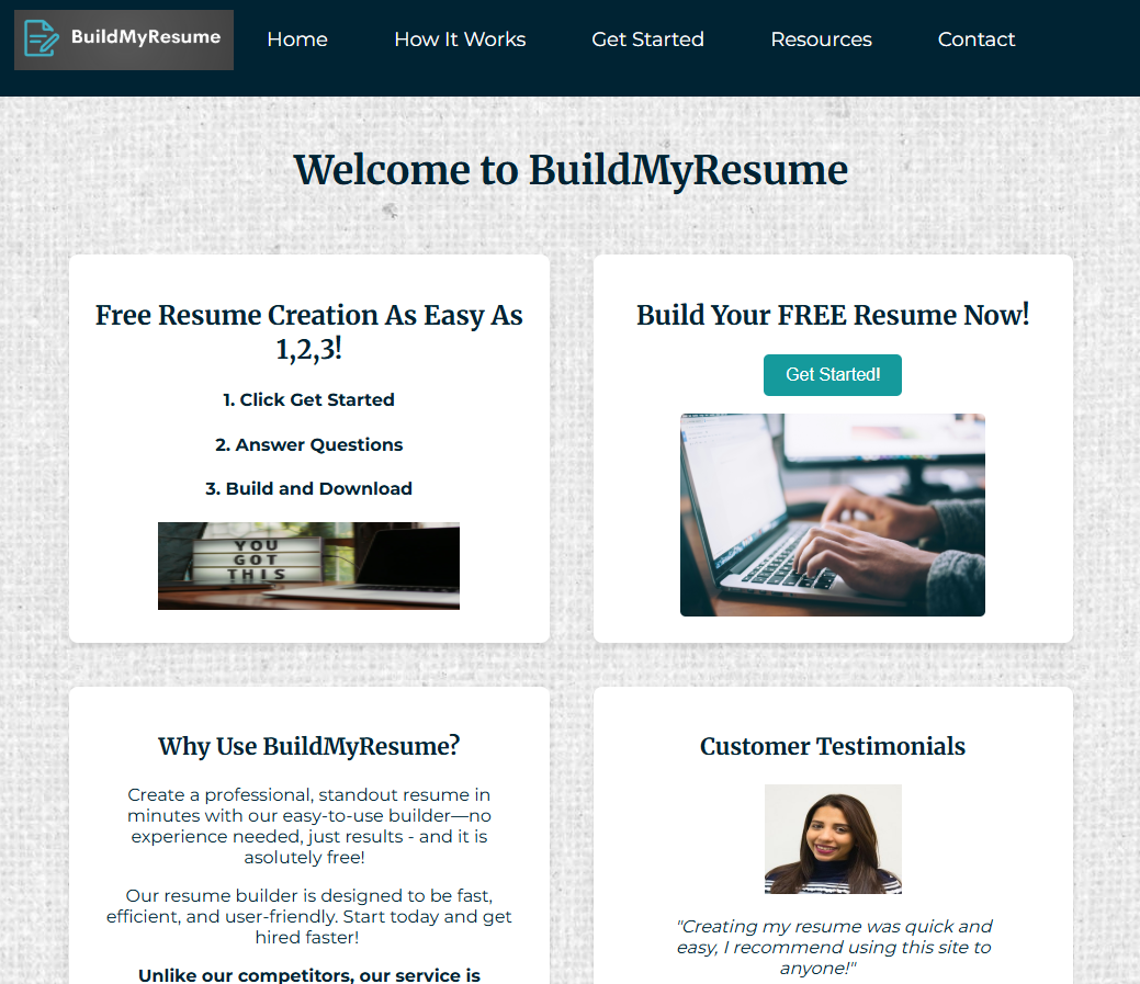
The high-fidelity layouts apply the visual system to full interface compositions. The homepage emphasizes a strong Get Started action, a simple three-step process, testimonials, and supporting promotional space.
An alternate layout explores a different navigation orientation and content balance while keeping the same core components and brand language.
Homepage direction
Horizontal navigation with a centered hero, instructional steps, testimonials, and supporting promotional areas.
Alternate layout
Vertical navigation exploration with the same reusable content blocks organized around a different page rhythm.
08 · BUILD Front-end development
Carry the interface decisions into a responsive web build
The project moved beyond planning and mockups into front-end development using HTML, CSS, JavaScript, and Bootstrap. The build focused on preserving the hierarchy, navigation, calls to action, and reusable visual patterns established during the design process.
Responsive structure was part of the development goal so the layout could adapt across screen sizes rather than remain a fixed desktop composition.
HTML
Semantic page structure and content organization.
CSS
Visual styling, layout, hierarchy, and responsive presentation.
JavaScript
Interactive behavior where needed within the experience.
Bootstrap
Responsive grid and reusable front-end components.
09 · OUTCOME Project outcome
A clearer starting point for first-time resume builders
BuildMyResume demonstrates a complete design path from user needs and information architecture through wireframes, visual design, high-fidelity interface work, and front-end development.
The strongest part of the project is the connection between the original research goal and the final interface: reduce confusion, show users what to do next, and keep the path forward visible.
ResearchUser-centered direction
The journey map defined beginner needs, frustrations, and expectations before visual design began.
StructureFocused information architecture
A compact sitemap keeps the experience understandable and task oriented.
DesignReusable visual language
Typography, color, imagery, and repeated components create a consistent interface.
DevelopmentDesign-to-code workflow
The project connects UX planning and interface design with responsive front-end implementation.