2D Animation · Character Design Case Study

Caution Carl

Caution Carl is a playful 2D animated character project built to show personality, motion, and visual storytelling through expressive design. The goal was to create a memorable character that feels entertaining at a glance while still demonstrating strong animation fundamentals.

Role: Designer & Animator Adobe Illustrator + Animate Character design + motion
Caution Carl character artwork
Safety Patrol, but make it fun.Simple shapes, a bold caution palette, and an approachable personality built for motion.
01 · CONTEXT Project overview

A safety mascot with enough personality to carry a story

Caution Carl was designed as a character piece that blends personality, motion, and visual clarity into one playful animation project. Rather than relying on heavy detail, the project uses shape language, expressive movement, and a strong caution-inspired theme to make the character memorable at a glance.

Project type2D character animationCharacter design + motion
Primary goalCreate an engaging animated mascotClear, readable, and approachable
My roleConcept, design, and animationFrom visual direction through presentation
Key strengthExpressive movement + readabilitySimple shapes that stay clear in motion
02 · DESIGN CHALLENGE Problem + solution

Playful enough to connect. Simple enough to animate.

The central challenge was creating a character that could instantly communicate a caution-themed identity without becoming stiff, overly detailed, or difficult to animate.

The problem

Communicate the theme without overdesigning the character

The character needed to feel playful and caution-themed at a glance while balancing personality, silhouette, and motion. Too much detail would make Carl harder to read and harder to animate smoothly.

The solution

Use clean shapes, bold color, and expressive posing

I developed Caution Carl as a bright, readable character with exaggerated body language and a strong visual theme. Clean forms and controlled timing helped the finished animation feel lively, clear, and memorable.

03 · CONCEPT Moodboard + visual direction

Start with the visual language of safety

I explored how to turn a caution-inspired theme into a character that felt fun, approachable, and full of personality. The moodboard brought together crossing guards, traffic cones, hard hats, whistles, crosswalks, bright safety colors, and expressive poses.

Those references helped establish the core direction before I refined Carl himself: recognizable safety cues, a simple silhouette, and an energetic orange-and-yellow palette that could stay readable in motion.

ShapeTraffic-cone silhouette and simple rounded forms.
ColorOrange, yellow, cream, and dark neutral accents.
PersonalityHelpful, cautious, warm, and a little goofy.
04 · CHARACTER DESIGN Turnaround + character direction

Build a character that stays recognizable from every angle

I refined Carl's silhouette, shapes, and color choices to make him visually distinct and readable. The character sheet tested the design from front, three-quarter, side, and back views while also establishing the personality behind the mascot.

Character

Carl is the shy new crossing-guard and safety-patrol character of Brightblock City, designed to make safety feel friendly rather than intimidating.

Visual identity

The traffic-cone body, hard hat, safety orange, cream stripe, and simple face make the theme immediately recognizable.

Personality cue

His whistle, cautious nature, and “1, 2, 3, Safety” rhythm give the character a small behavioral hook that supports the story.

05 · BUILD Animation-ready character

Keep the design clean enough to move

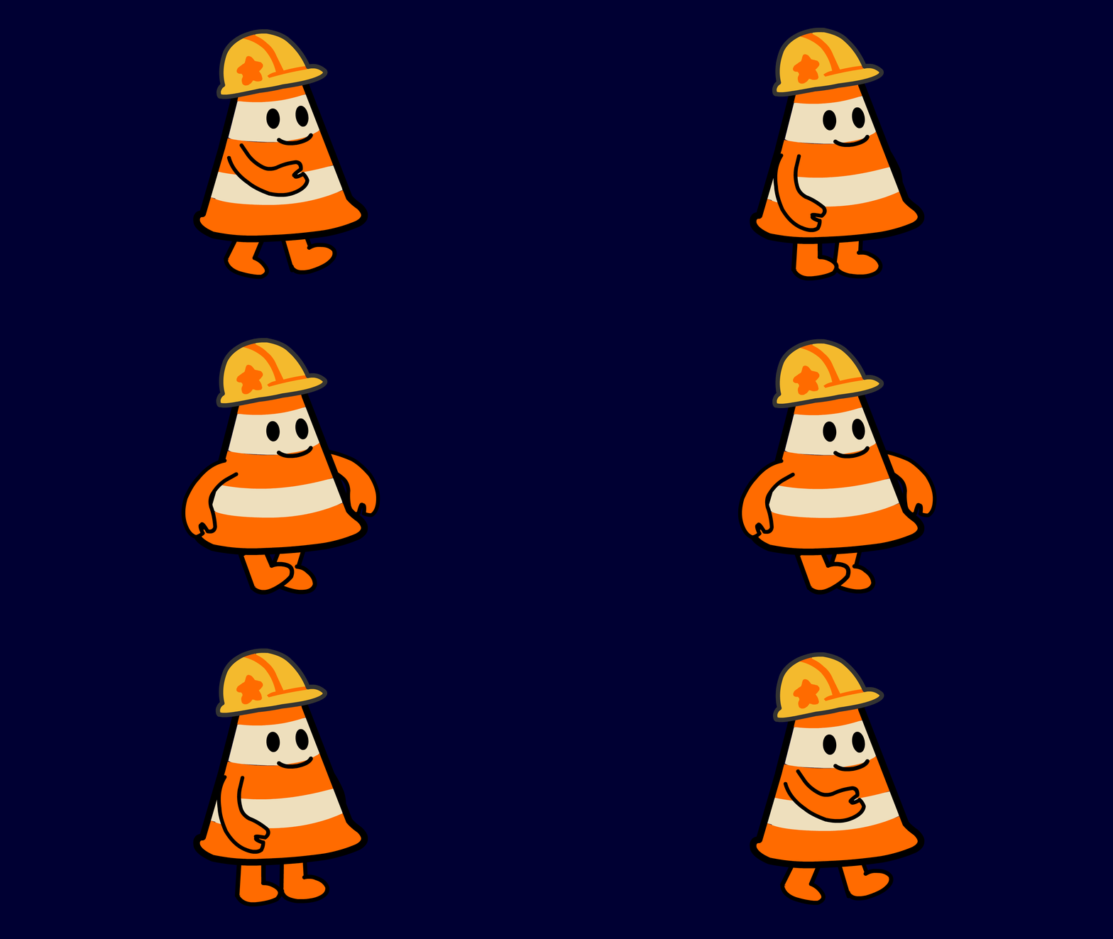
The character's simple construction was intentional. Carl needed enough personality to feel memorable, but the shapes also had to stay manageable once the project moved from illustration into animation.

Clear silhouette and large graphic shapes keep the character readable while moving.
Separated arms, legs, face, and body elements support expressive posing without adding unnecessary detail.
The repeated orange, cream, yellow, and dark accents keep the visual identity consistent across poses.
Caution Carl animation-ready character artwork
06 · STORYBOARD Plan the safety story

Work out the action before animating the scene

The storyboard breaks a short crossing-safety scene into shots, action, dialogue, timing, and audio notes. Carl sees a child chase a ball toward the street, stops him, explains a safer choice, and walks across the crosswalk with him using the “1, 2, 3, Safety” reminder.

Storyboard · Page 1

The scene establishes Carl on patrol, introduces the danger, and has him stop the child before entering the street.

Storyboard · Page 2

Carl guides the child through the crosswalk sequence and finishes the scene after safely retrieving the ball.

07 · FINAL MOTION Animation + outcome

Give the simple design a clear sense of energy

I animated Carl with an emphasis on timing, spacing, and movement that supported the character's energy and personality. The final piece shows how a very simple character can still feel expressive when the poses and motion are doing the storytelling.

The finished project became a memorable animated mascot that demonstrates character design, visual storytelling, and 2D motion in one cohesive piece.

I then prepared the project as a portfolio-ready case study so the concept work, character development, story planning, and finished animation could be seen as one connected process.