Advertising Poster Case Study

Pierce New Media & Digital Design Poster

An advertising campaign poster created to promote Pierce College’s New Media and Digital Design program by showing creativity as a transformation from an early idea into polished digital work.

Role: Graphic Designer Adobe Illustrator + Photoshop DDSGN 135
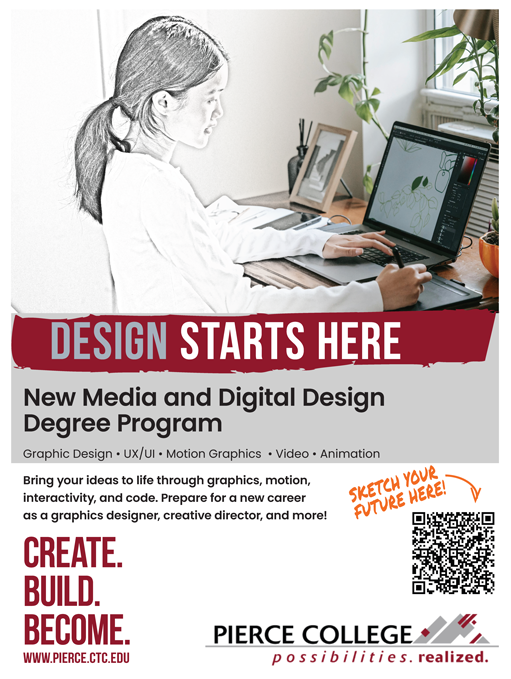
Final Pierce College New Media and Digital Design advertising poster
Sketch → design → career
01 · CONTEXT Project Overview

Turn a creative interest into a visible path forward

The project was created as an advertising campaign poster for the Pierce College New Media and Digital Design program. Its purpose was to introduce the program to students interested in creative technology, graphic design, UX/UI, animation, video production, and digital storytelling.

The central visual concept shows a photo shifting from pencil sketch to finished color. That transition represents the larger idea behind the program: students can begin with rough creative ideas and develop them into polished, portfolio-ready work.

Project Type Advertising Campaign Poster College program promotion
Audience Future creative students High school, college, aspiring artists + young adults
Core Message From concept to career Connect creative interests to a real educational path
Visual Idea Sketch transforms into color Growth from rough idea to finished design
02 · DESIGN CHALLENGE Problem + Solution

Make the program understandable before asking students to imagine a career

Many creative students may enjoy art, design, media, or technology without realizing those interests can connect to a college program or a professional direction.

The Problem

Creative interests do not always look like a clear college path

Students may not realize that digital design can include graphic design, UX/UI, animation, video, coding, and digital storytelling, or how those interests can connect to portfolio development and career preparation.

The Solution

Show creativity as a process of growth

The split sketch-to-color image visually communicates transformation while the typography and supporting content make the program feel modern, approachable, and focused on building practical creative skills.

03 · AUDIENCE + MESSAGE Campaign Strategy

Simple, visual, and career-focused

The campaign direction was built for high school students, current college students, aspiring artists, and young adults exploring creative careers in the Pierce College area.

The brief also considered other community colleges, online design programs, certificate programs, bootcamps, and self-paced learning platforms. The opportunity for Pierce was to emphasize a structured program, instructor support, portfolio development, and multiple creative pathways.

Campaign Idea Design starts here

The final poster turns the creative-process concept into a direct headline that works quickly from a distance.

Creative Direction From concept to career

The message connects the act of making with a longer-term educational and professional path.

Original Brief Motto Sketch your path. Build your portfolio.

The early message helped establish the transformation and portfolio-development theme.

Tone Creative + professional

The campaign needed to feel student-friendly while still looking polished enough for a college program.

04 · CONCEPT DEVELOPMENT Layout Sketches

Explore the composition in black and white first

The assignment called for multiple detailed black-and-white poster compositions before moving into full color. The sketches focused on headline placement, image balance, supporting text, program information, calls to action, and Pierce College branding.

The strongest direction placed the student image at the top, gave the headline a large visual break across the middle, and used the lower portion for program information, a QR-code call to action, and the college identity.

05 · VISUAL SYSTEM Color + Brand Direction

Use Pierce recognition without losing the creative edge

The visual direction was defined as clean, modern, creative, and professional. The palette combines Pierce-inspired crimson and cool neutrals with a warm orange accent and dark charcoal for contrast.

The final poster uses strong condensed display typography for impact, cleaner supporting type for readability, and the Pierce College logo to anchor the piece as an official-looking program promotion.

College Identity Pierce College possibilities realized logo
01Recognizable

Keep Pierce branding visible and trustworthy.

02Creative

Use the sketch transition and hand-drawn accent to signal making.

03Readable

Separate headline, program information, and call to action into clear layers.

06 · IMAGE MAKING Sketch-to-Color Photo Treatment

Make the concept visible before the viewer reads a word

The main photograph was edited in Photoshop so part of the student and workspace appears as a pencil drawing while the rest remains photographic and full color.

This treatment became the visual metaphor for the entire campaign. The sketch side represents the beginning of an idea, while the finished side represents the technical skills and refinement that can develop through the program.

07 · FINAL DESIGN Finished Poster

A recruitment poster built around transformation

The final poster combines the edited image with a bold “Design Starts Here” headline, the New Media and Digital Design program name, a concise list of creative disciplines, career-focused supporting copy, and a QR-code call to action.

Large blocks of crimson and gray create structure, while the orange handwritten “Sketch Your Future Here!” note adds a more personal, creative voice. The repeated “Create. Build. Become.” message reinforces the path from learning to professional development.

Click the poster to view it larger.

08 · OUTCOME Final Result

A poster that makes the design process part of the message

The finished piece brings the project’s main idea, audience, Pierce College identity, and promotional information into one clear visual story.

CREATE. BUILD. BECOME.
The strongest part of the project is that the visual treatment does more than decorate the poster. It directly communicates the idea of turning an early creative concept into polished work.