Mobile UI · UX Case Study

PlayNext Gaming App Design

A gaming companion app concept designed to reduce backlog overload, surface unfinished games, and make it easier for players to decide what to play next.

Role: UX/UI designer Figma + mobile interface design Gaming companion app concept
PlayNext mobile start screen with Create Account and Sign In buttons
01 · CONTEXT Project overview

Helping gamers reclaim their play time

PlayNext was created around a familiar frustration: subscription libraries make it easy to collect games, but much harder to keep track of progress, priorities, and shared sessions with friends.

The concept reframes that problem as a lightweight, mobile-first experience. Instead of forcing users to dig through cluttered menus or remember everything themselves, the app organizes unfinished titles, highlights what matters now, and nudges the next action forward.

Project typeMobile app conceptUX/UI case study for a subscription gaming companion
Primary usersConsole + PC gamersPlayers managing large backlogs across Game Pass and PS Plus
My roleResearch, IA, wireframing, UI designPlanned the structure and built the visual direction
Key messageOwn less backlog, enjoy more playUpbeat, spoiler-free, and privacy-first
02 · PROBLEM Problem and goals

Choice overload turns play into friction

Services like Xbox Game Pass and PlayStation Plus make access easy, but abundance creates a different problem: players forget what they own, lose momentum mid-campaign, and miss opportunities to finish or share games with friends.

PlayNext responds with a focused dashboard, simple goals, and friend-aware session planning. The experience is meant to feel energetic and game-inspired without overwhelming users with too much data or revealing spoiler-heavy progress details.

ProblemBacklog confusion

Players spend time scrolling, double-checking progress, and deciding what to play instead of actually playing.

GoalPhone-first tracker

Auto-import libraries, surface progress, and support finish or co-op goals in a compact mobile UI.

Planned metricFewer “what should I play?” moments

The concept aimed to reduce decision friction during short testing and interview cycles.

Planned metricMore completed games

Success was framed around helping users finish more titles and see better value in their subscriptions.

03 · STRATEGY Research and direction

A lightweight experience shaped around real player habits

The creative brief framed PlayNext as a response to backlog overload, missed co-op opportunities, and the constant movement of subscription catalogues.

That direction led to a structure centered on clarity: keep the interface spoiler-free, focus attention on the next meaningful action, and support both individual progress and social play without clutter.

AudienceSubscription gamers aged 13–40

Primary users are players with Game Pass or PS Plus libraries and a large number of unfinished titles.

CompetitorsBackloggery, GG App, TrueTrophies

Existing tools either rely on manual entry, limited sync, or achievement-heavy interfaces.

DifferentiatorGoal-oriented dual-library concept

PlayNext combines subscription awareness, next-step planning, and friend coordination in one mobile flow.

RequirementsCore feature set

Auto-sync, a “Now Playing” dashboard, goal tracking, leaving-soon alerts, and shared session planning.

Design thinking flow

Research → ideation → low fidelity → high fidelity → case study → final visual design.

Product voice

Upbeat, focused, and helpful. The UI should feel like a quick game lobby rather than a spreadsheet of chores.

04 · IA Sitemap and information hierarchy

Organizing the app around one clear hub: what to play next

The information architecture starts from a simple center of gravity: the Home / Now Playing view. From there, the app branches into Library, Goals, Friends, Stats, Alerts, and Settings.

This structure keeps the experience focused while still allowing deeper views such as game detail, goal detail, session planning, and alert details. Each major area supports a distinct player question rather than mixing every feature into one screen.

Sitemap

Core app structure

Load / sign-in leads into a central dashboard with six main navigation branches and focused child views.

Hierarchy

Purpose by page

The hierarchy maps each page to a job, from current progress on the home view to goals, stats, alerts, and account settings.

05 · LOW FIDELITY Wireframe exploration

Sketch first, style later

Low-fidelity wireframes were used to define screen priorities before visual design. This stage focused on layout, navigation behavior, and the relationships between home, library, goals, stats, friends, alerts, and settings.

The sketches helped test where the bottom navigation should live, how list-based views should scroll, and how actionable features like “Start Session” or “Add Goal” could remain visible without crowding the interface.

Entry, home, and library

Initial sketches for the start screen, now-playing dashboard, and a vertically scrolling library view.

Goals, stats, and friends

These views explore how player goals, charts, and social coordination could fit into the navigation system.

Alerts and settings

The final sketch page rounds out secondary utility views that support account links, alerts, and privacy controls.

06 · VISUAL SYSTEM Typography, color, and components

A clean gaming aesthetic with high contrast and quick visual cues

The visual system pairs Exo 2 for headings with Inter for body text to keep the interface readable while still feeling tech-forward.

A dark base keeps attention on the actions and content cards, while neon lime and pixel cyan provide strong contrast for calls to action, progress cues, and key interface moments.

Primary#1B1B2F
Surface#F0F2F5
Accent#3CF2FF
CTA#B4FF47
Exo 2
Fast. Focused. Playful.
Inter
Supports body copy, interface labels, and compact information without sacrificing legibility.
07 · HIGH FIDELITY Selected interface screens

A focused preview of the final mobile experience

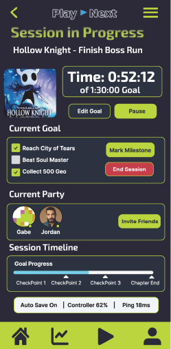
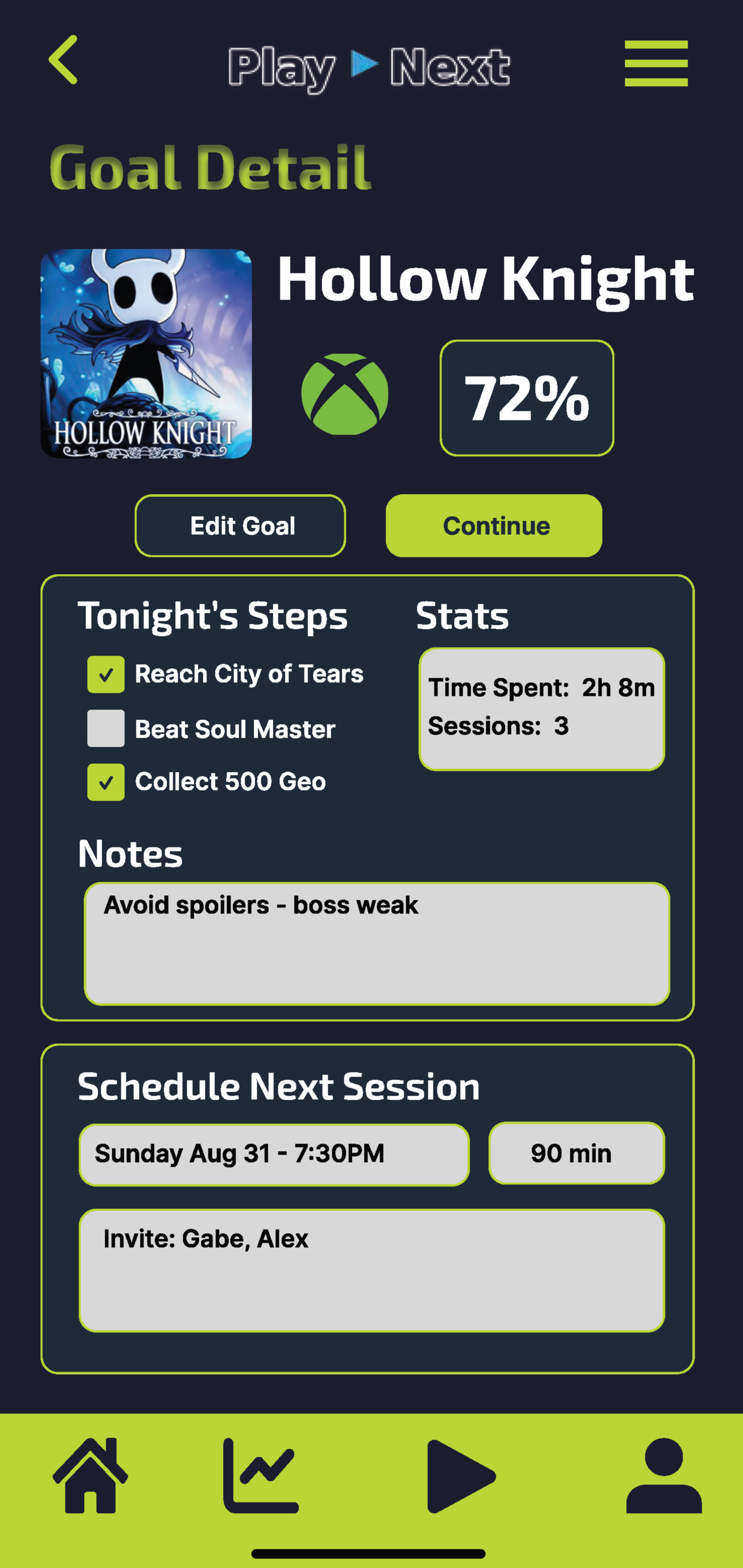
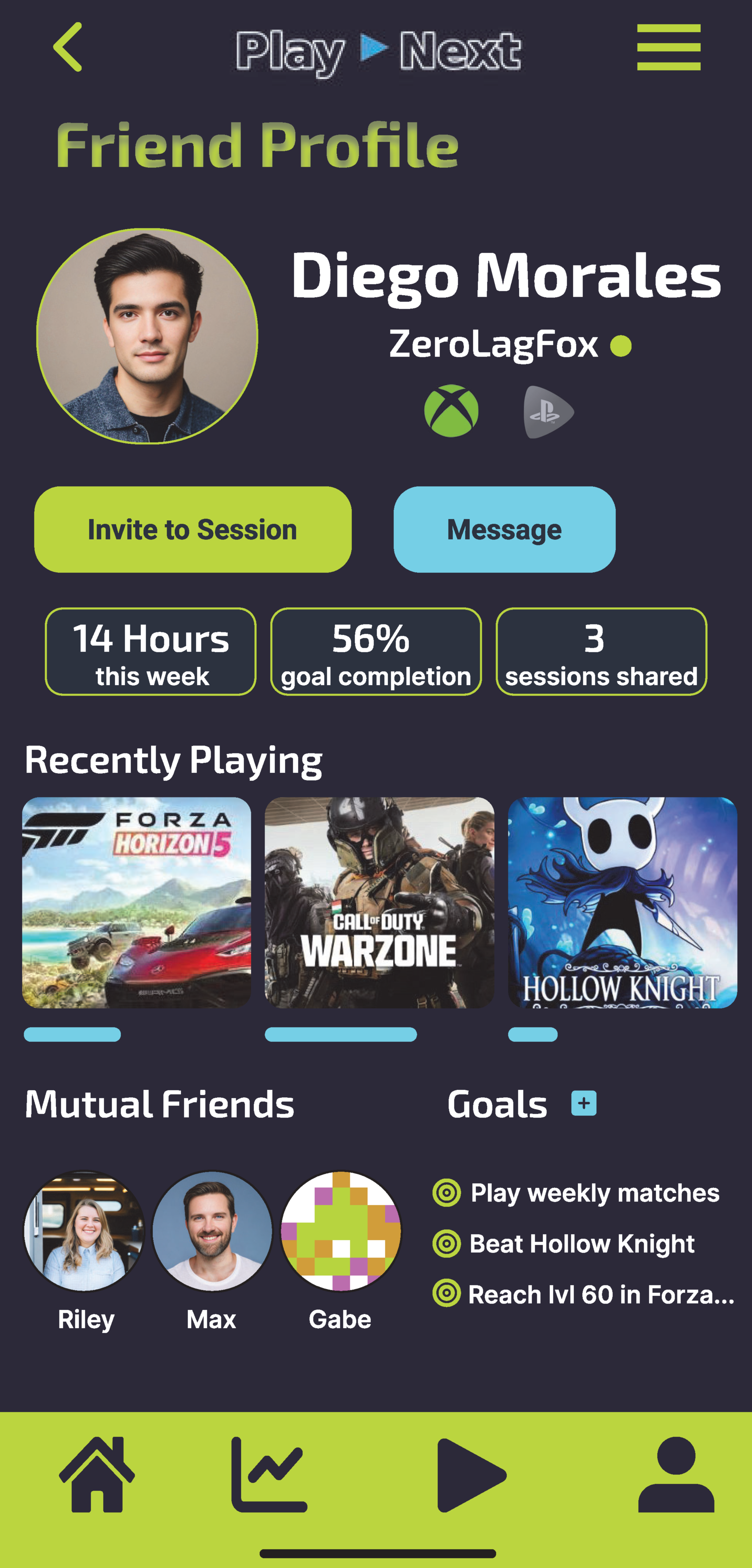
Rather than showing every completed screen at once, these three views highlight the main ideas carried through the high-fidelity design: current-game momentum, goal planning, and social play.

Together they show how the same typography, color system, navigation, and card language stay consistent across different parts of the app.

Now Playing

Centers the experience on the current game, progress, and the next session action.

Goals

Turns larger gaming objectives into visible targets for co-op, completion, and progress.

Friend Profile

Shows how social features connect recent games, shared goals, and session planning.

08 · FEATURES Feature focus

Designing around momentum, not just storage

PlayNext is not just a catalogue. Its strongest ideas revolve around helping players keep momentum: continue a game, schedule a session, finish a goal, or act on a leaving-soon alert.

Each feature is meant to answer a practical question quickly: What am I playing? What matters tonight? What should I finish? Who can I invite? What’s leaving soon?

DashboardNow Playing at the center

The home view anchors the experience around the current game, progress bar, and next session action.

GoalsMicro-goals and checklists

Goals can be broken into short, achievable steps to keep players moving forward.

PlanningSession coordination

Schedule cards help connect friends, timing, and play objectives without leaving the app flow.

SocialFriend-aware motivation

Profile views and invite actions support co-op play and shared backlog progress.

LibrarySubscription-aware browsing

Users can quickly scan connected titles and move into deeper detail or goal-setting views.

Alerts + statsUseful reminders, not noise

Alerts and stats keep players informed about progress, time, and expiring catalogue opportunities.

09 · PROTOTYPE Interactive prototype

Connecting the screens into a usable PlayNext flow

The interactive Figma prototype brings the high-fidelity screens together so the navigation, screen relationships, and core interactions can be experienced as a connected mobile flow instead of a collection of static layouts.

The prototype demonstrates how users can move through the PlayNext concept and gives the project a more realistic sense of pacing and interaction.

Open Figma Prototype
10 · OUTCOME Project outcome

A strong concept foundation for a gamer-focused mobile product

PlayNext demonstrates a full design path from product framing and information architecture through wireframing, component planning, and polished interface screens.

The final case study shows how a focused UX direction can turn a vague frustration—too many games and too little momentum—into a clear, usable product concept.

“Own less backlog, enjoy more play.” That message stayed central throughout the process and helped keep every major design decision pointed toward clarity, motivation, and ease of use.
What it showsEnd-to-end mobile UI thinking

The project connects brief writing, UX planning, screen hierarchy, and visual design in one portfolio piece.

StrengthClear visual consistency

Typography, color, and repeated components create a coherent look across very different app views.

UX focusActionable instead of cluttered

Rather than packing in every possible stat, the app keeps users oriented around the next step to take.

Next stepUsability testing and refinement

With the interactive prototype complete, task-based testing would be the next step for identifying friction and refining the experience.