Typography & Layout Case Study

Respawn Magazine Layout

My Respawn magazine layout is an editorial design project created to combine strong typography, visual hierarchy, and structured page composition into a polished magazine experience. The goal was to design a layout that feels bold and engaging while keeping the content easy to read and visually organized.
Role: Editorial Designer Adobe InDesign, Illustrator + Photoshop Typography + Editorial Layout
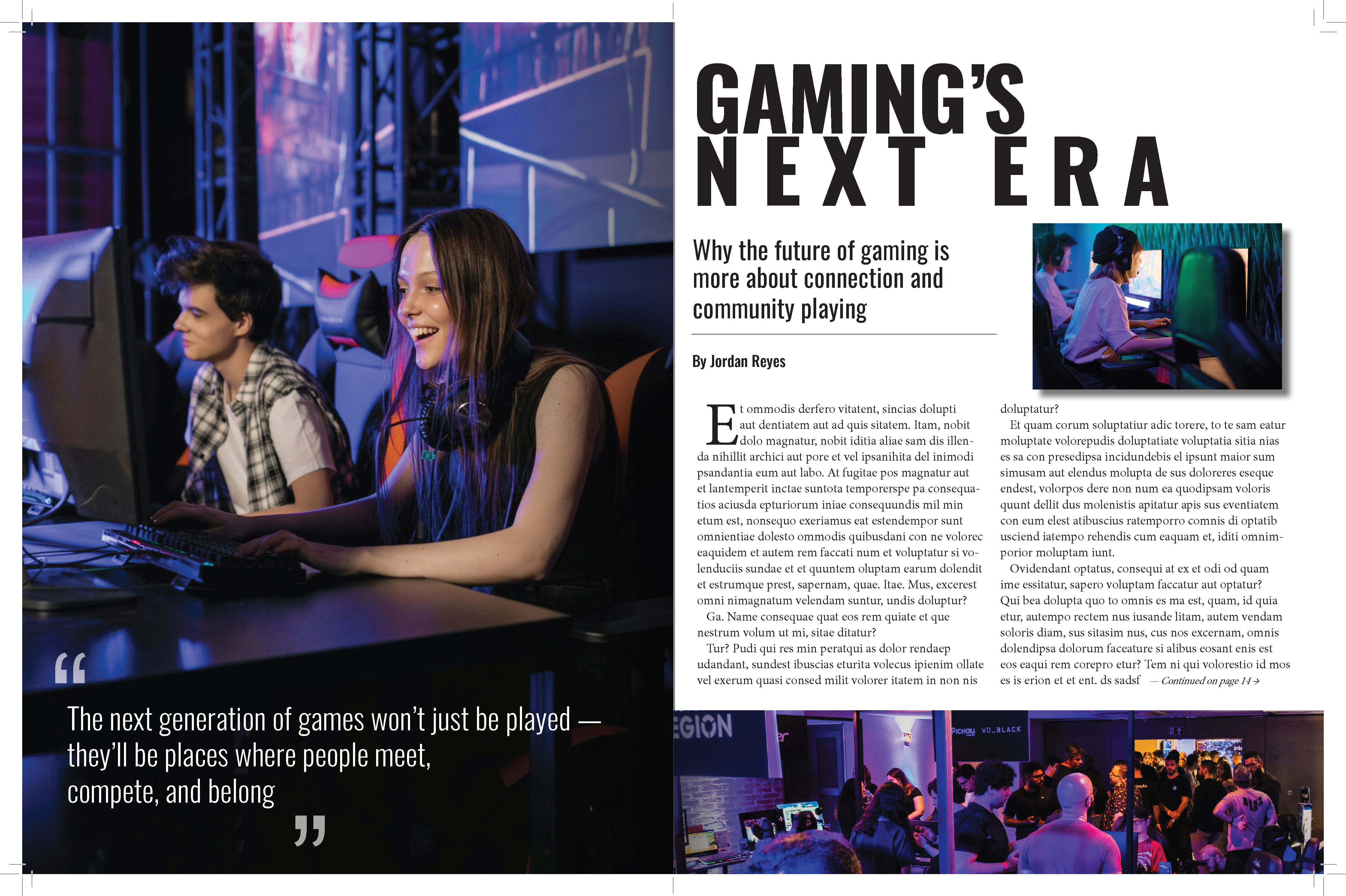
Respawn Magazine editorial spread preview
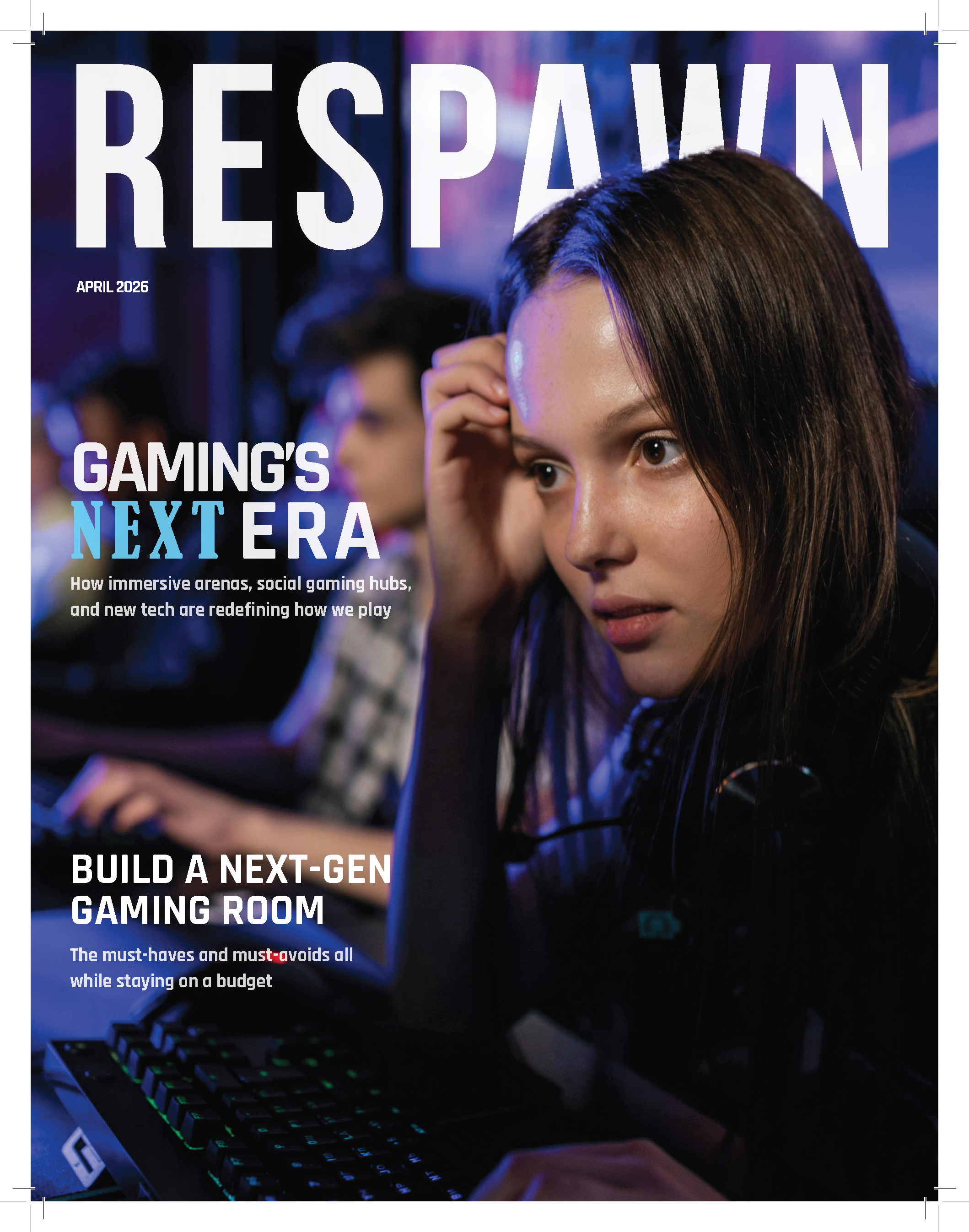
Respawn Magazine cover featuring Gaming's Next Era
01 · CONTEXT Project Overview

Typography and layout working as one system

Respawn Magazine Layout was created to showcase how typography and layout can work together to create an engaging editorial reading experience.

The project focused on structure, readability, and visual rhythm so that each page would feel intentional, cohesive, and visually compelling from headline to body copy.

Project Type Editorial Layout Design Magazine typography and page composition
Primary Goal Create a readable, engaging magazine spread Balance visual impact with clarity
My Role Typography, layout, and visual composition Organizing the complete editorial experience
Key Strength Balanced hierarchy and page flow Guiding the reader through the content
02 · DESIGN CHALLENGE Problem + Solution

Bold enough to grab attention. Structured enough to read.

The central challenge was keeping the editorial design visually exciting without allowing the typography, imagery, or page composition to compete with the reading experience.

The Problem

Create visual energy without sacrificing readability

The challenge was to create a magazine layout that felt visually exciting without sacrificing readability. The design needed to manage typography, imagery, spacing, and page structure in a way that guides the viewer naturally through the content while still feeling bold and modern.

The Solution

Build a clean editorial system with a clear hierarchy

I designed a clean editorial layout system with strong typographic hierarchy, thoughtful spacing, and a balanced relationship between text and visuals. The final result creates a polished magazine spread that feels dynamic, organized, and easy to navigate.

03 · DESIGN SYSTEM Editorial Priorities

Structure, rhythm, and hierarchy drive the pages

Rather than treating the spread as a collection of separate elements, I used typography, grid structure, spacing, and image placement to create one consistent reading flow.

Typography

Type choices and hierarchy were used to create clarity, rhythm, and emphasis throughout the spread.

Layout System

Grid structure and spacing helped create balance between text, images, and white space.

Design Goal

The spread needed to feel bold and modern while still supporting an easy reading experience.

Outcome

A polished editorial design that highlights strong composition, hierarchy, and typographic control.

04 · PROCESS My Role

Shape the content from planning through presentation

My role covered the organization, typography, page composition, and final presentation of the magazine design.

1

Content Planning

I considered how the information should be organized so the layout would support both visual interest and readability.

2

Typographic Hierarchy

I established headline, subhead, and body text relationships to create a clear and consistent reading flow.

3

Page Layout

I built the spread using balanced composition, spacing, and grid structure to make the design feel polished and intentional.

4

Final Presentation

I prepared the final layout as a portfolio-ready case study that clearly communicates the editorial design direction and finished outcome.

05 · FINAL DESIGN Project Gallery

See the hierarchy and page flow at full scale

The finished pages show how the typography, imagery, spacing, and composition work together across both the cover and editorial spread.

Click either image to view it larger.

06 · OUTCOME Final Result

A polished editorial system with a clear reading flow

The final result creates a polished magazine spread that feels dynamic, organized, and easy to navigate.

A polished editorial design that highlights strong composition, hierarchy, and typographic control.